Anduril:MiniLatticeDesignSystem
IfoundAnduril'sopen-sourcereconnaissanceapp,hadnoUItoworkfrom,andusedmydesignsystemknowledgealongsideAIandFigmatoolingtoextractaminicomponentlibrary,wireittoGithub,andshiparunnabledevenvironment.

Where it started
I came across Anduril's open-source sample-app-auto-reconnaissance repository and saw an opportunity. The repo implements an Entity Auto Reconnaissance System (EARS) using the Lattice SDK — three concurrent Python processes exchanging structured data with no frontend whatsoever. No UI, no browser, no screens. Just code.
I wanted to see if I could use my design system knowledge, AI tooling, and Figma's most modern features to extract a real, working design system from it — one backed by a runnable React dev environment, documented in Storybook, connected to Figma via Code Connect, and built without ever needing a design spec handed to me.
Navigating the codebase
One of the things I've developed over the years is the ability to move through unfamiliar codebases quickly. I used AI to help me read every Python source file and extract the full data model: entity fields, enum values, state machines, system constants, and log output patterns. The Lattice SDK turned out to be design-rich once you know what to look for — five disposition states, four task status values, two ontology types, a proximity trigger, entity TTL logic, and a publish cadence. All of that structure maps directly to UI.
There was an additional constraint worth noting: without a formal affiliation with an Anduril program, I had no access to the Lattice SDK directly. Rather than stop there, I worked with what was publicly available — the open-source sample app — and used the Python source code itself as a proxy for the SDK's data model. Reading the code became the design research.
This is the inverse of how design systems usually work. Normally you systematize what's already on screen. Here, the data model was the design spec — I just had to read it.

Building the component library
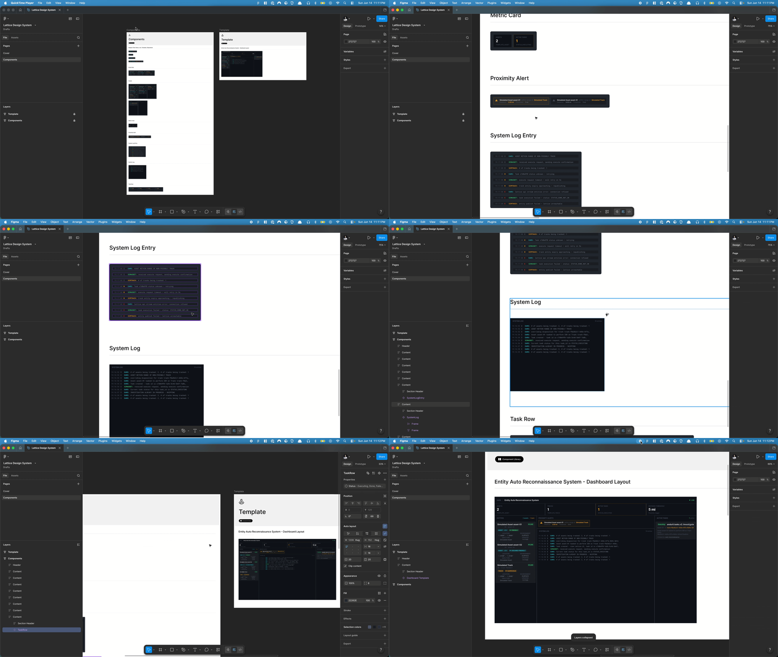
From the domain model I derived a component inventory where every piece maps to a real system state — nothing speculative. 13 components in total, organized from atoms to a full dashboard template: disposition and status badges, entity and task rows, a proximity alert, metric cards, scrollable panels, a system log, and a 1440×900 DashboardLayout. TypeScript interfaces mirror the Python field names exactly, and Storybook stories use mock data that recreates the exact scenario from the repo's README — two assets, one track, one executing task, and a 2.93-mile proximity alert.
- DispositionBadge — 5 mil_view.disposition enum values, each visually differentiated
- TemplateBadge — ontology.template (ASSET vs TRACK), the primary entity classification
- LiveBadge — is_live boolean, since expiry creates a distinct UI state
- TaskStatusBadge — 4 status.status values driving the task lifecycle
- EntityRow — one row per entity, combining all entity fields at a glance
- TaskRow — one row per task, combining status, assignee, target, and description
- ProximityAlert — the core system event: asset within 5 miles of a non-friendly track
- MetricCard — summary counts for assets, tracks, active tasks, and threshold config
- EntityPanel — scrollable entity list with asset/track filter
- TaskPanel — active task list mirroring Lattice's task management panel
- SystemLogEntry — single log line with logger name, level, timestamp, and message
- SystemLog — scrollable log output mirroring the EARS/SIMASSET terminal
- DashboardLayout — full-page template: header, metrics row, three-panel grid
Storybook
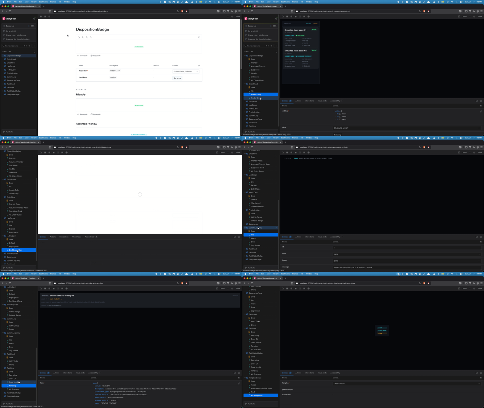
Every component is documented in Storybook 10, giving the library a living reference that runs independently of any application. Each story isolates a component and walks through its full range of variants — all five disposition states, all four task status values, live vs. expired entities, populated vs. empty panels, log entries at different severity levels. The mock data is constructed to mirror the exact scenario from the original repo's README, so the stories aren't just visual demos — they represent real system states the EARS application would actually produce.
Design tokens
The token system is grounded in the domain rather than aesthetics. Background layers follow a four-depth dark stack appropriate for a tactical dashboard. The disposition and task status enums each map to a semantic color token — friendly green, assumed teal, suspicious amber, hostile red, unknown gray — so the visual language reflects the system's actual logic. Everything lives in a Tailwind v4 @theme block, generating utility classes automatically with no config file needed.

Programmatic Figma generation
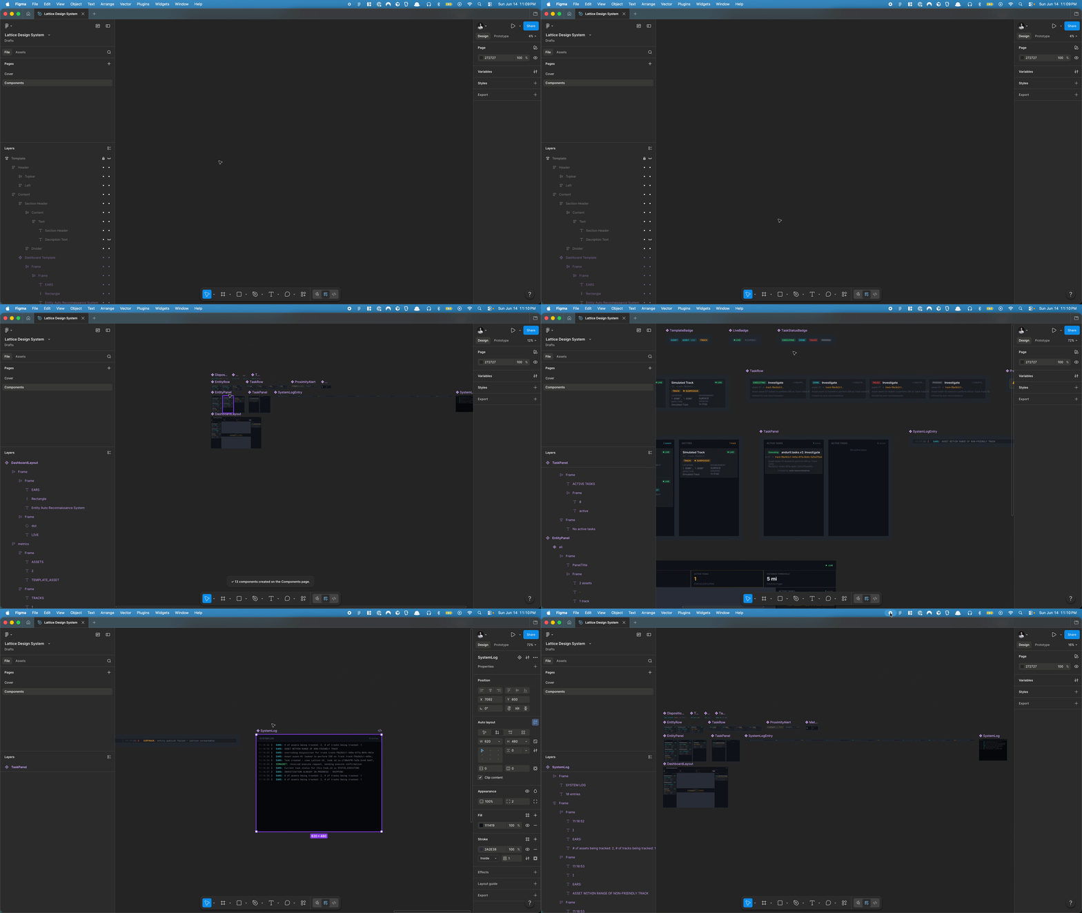
The Figma REST API is read-only — you can't create or modify nodes through it. The only programmatic path is the Figma Plugin API, which runs a JavaScript sandbox inside the desktop app. I built a plugin that generates all 13 component sets in under two seconds, organized into four rows by atomic level, plus a full variable collection with 30+ tokens sourced directly from the same definitions used in code. Every variant property name matches what the Code Connect files expect exactly, so nothing needs to be renamed before publishing.
Closing the loop with Github
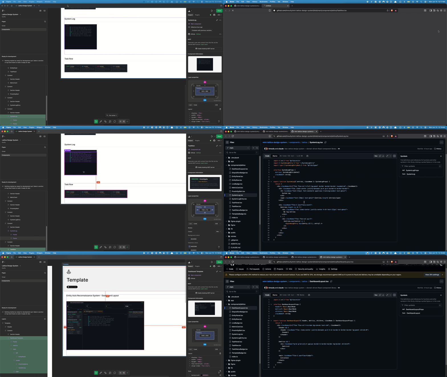
To connect the Figma components back to the codebase, I linked each component directly to its implementation on Github. In Figma's dev panel, each component points to the corresponding source file in the repository — so anyone inspecting a component can jump straight to the code that backs it. It's a manual process, done by pasting the direct links to each component file, but it closes the loop between what's in the design file and what's actually shipping.
The more elegant solution would be Figma Code Connect — which publishes code snippets directly into the dev panel so designers see real, prop-accurate component usage the moment they select something on the canvas. The .figma.tsx files for every component are written and ready to publish. The constraint is that Code Connect is only available on Figma's Organization and Enterprise plans, which puts it out of reach for personal projects. But the infrastructure is in place: the moment that plan access exists, publishing takes a single command.
What this all adds up to
Starting from a Python backend with no UI, this project produced a complete design system end to end: 13 domain-driven React components documented in Storybook, a semantic token system grounded in the application's data model, a Figma plugin that generates the full component library and variable collection programmatically, and Github links connecting every Figma component back to its source file. The Code Connect bindings are written and waiting — one publish command away once Organization or Enterprise plan access is available.
That alignment opens up something beyond handoff. When designers prototype using a library that's connected to production code through Code Connect, and that library is accessible to AI tools via the Figma MCP server, prototypes stop being approximations. The MCP server lets AI agents read your actual Figma file — components, variants, tokens, properties — and generate or scaffold code that reflects what's genuinely in the design system. Prototype with the right library, and you're not mocking up the product anymore. You're building it.


